
2018 Sherwin Williams Color of the Year
Sherwin Williams recently announced their 2018 Color of the Year. It’s bold, it’s mysterious and it’s completely unexpected.
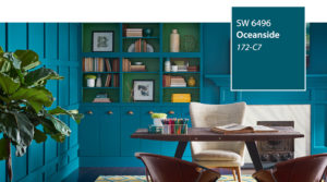
SW 6496 Oceanside
We have seen jewel tones and folk inspired colors trending for a couple of years now. What is unique about this color is the hybrid effect that blends its way into so many other colors. Oceanside is not quite blue and not quite green, it’s both enthusiastic and moody, familiar and unfamiliar and we are already in love with it.
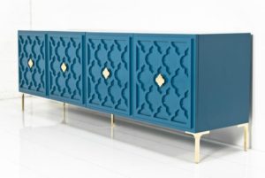
Consider using Oceanside for beautifully dramatic furniture pieces. The richness of the blue creates a sense of opulence. Pair with gold accents for added luxury.
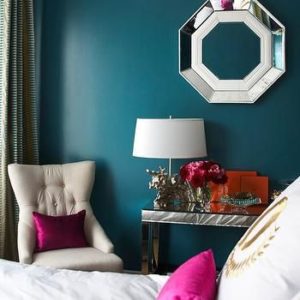
Or, pair with silver accents for a more relaxed, contemporary feel.
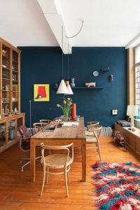
Oceanside pairs well in mid century modern inspired spaces. Warm wood tones blend effortlessly against the richness of this hue. Stay with the lighter toned woods and finishes to add contrast against the blue. This will help add layers to your space and provide added drama for minimal effort.
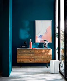
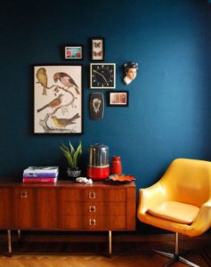
Oceanside loves Mid Century Modern. It’s a match made in design heaven. This color is bold and unfussy. The design should be the same. Keep it minimal and focus on small detail and clean lines. Let the color do the work for you.
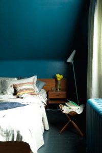
When in doubt. Saturate. While Oceanside works great as an accent, it is also a hardworking, multi-tasking color. If you have a small nook, an interesting angle, or an entire room, go all in and paint it all! We tend to not say this often when working with colors, but that is the beautiful mystery of this color, it just works. Keep in mind that deeper colors will make small spaces appear smaller, but this isn’t necessarily a bad thing! Embrace the color, feed your wanderlust, indulge your senses. Sometimes all it takes is a fresh coat of paint! Until next time -D


One Comment
Pingback: