No Green, No Problem: How to Decorate for St. Patrick’s Day
St. Patrick’s Day is right around the corner. Soon our drinks, our food, even our rivers will be awash with green to celebrate the day. Want to throw the best St. Patrick’s Day party or decorate your home to celebrate, but green isn’t your favorite color? Fear not! Keep in mind that the best, most successful designs don’t simply recreate an image or idea, but Capture The Essence of the inspiration.
Stay true to your design style and create a look that is classic and sophisticated but still shows hints and references to the holiday. Allow for some green moments but compliment it with other colors, bold prints and accessories that you love. We love bold, arty spaces that are chic, fun and feminine. Follow our step by step guide, style tips and shopping lists to create your own unique space.
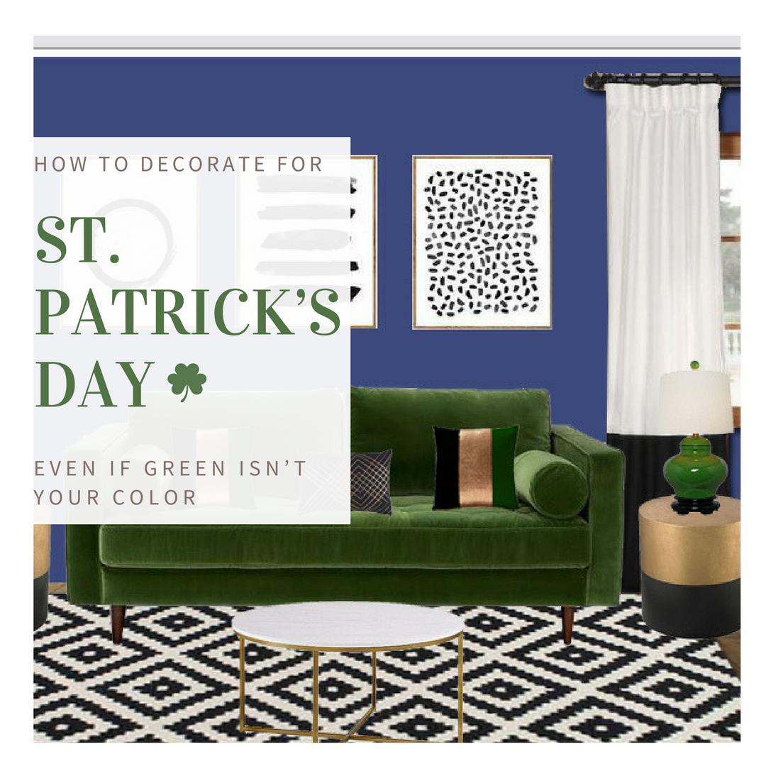
Bohemian Chic St. Patrick’s Day Inspired Living Room
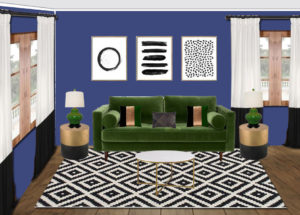
1. Go Green with an Emerald Sofa and Accessories
Every design needs a statement piece. Often times the statement piece is the “big ticket” item for the room. It is the one piece that will remain no matter how many times you redesign the room. This piece is your chameleon. It is your work horse for the space. Select it wisely. Chose durable materials that will last and withstand the demands of your day to day lifestyle. Style Tip: If your furniture is runs the risk of encountering spills and stains opt for stain resistant, easy to clean fabrics such as Crypton.

Love the Look? Find it Here.
For this room we simply wanted a wisp of green. This is our design reference. Just like the creation of a great story, we tell them, tell them what you told them, and then tell them again. Evey thing is more powerful in threes. We used the color green three times, set the reference and then moved on to the rest of the the design story.
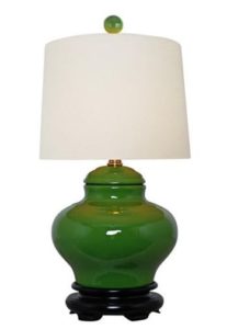
Love the Look? Find it Here.
Look for small doses of green to complete your design story. We love the deep emerald green of this lamp as the perfect compliment to the sofa. The white shade helps to break up the color to keep the green from overpowering the room while still maintaining the original reference.

Love the Look? Find it Here.
It’s always great when you can find one piece that includes the main colors of the room. It’s a great tie-in to complete the space. Notice how the amount of green utilized is slowly dissipating as we go through our three green iterations? That is the design trick! Use green at three times, but lessen the amount in each iteration.
2. Go Bold with Prints
Green is the official color of St. Patrick’s Day. If green isn’t your favorite color then don’t make it the star of the show. Use color and pattern to draw the eye in to the other complimentary accessories of the space. This takes a little bit of planning. You want to be able to find a bold enough pattern to draw the away but not so overpowering that it is distracting.

Love the Look? Find it Here.
We kept the color palette simple and opted for a bold geometric pattern. The interplay of the white and black against the deep emerald green sets the stage for the eclectic arty theme of the space. Style Tip: When mixing patterns with colors, keep it simple. Stick with large scale geometric patterns that are easier on the eyes to read.
3. Get Lucky with a Pot of Gold
Remember at the start of this post where we talked about capturing the essence of your inspiration? This reinforces your theme without overtly stating your reference. While St. Patrick’s Day may be filled with shamrocks, and all things green all the time, there are several other iconic elements such as leprechauns, lucky charms, rainbows and pots of gold. Gold instantly brings a level of chic sophistication in any space. When coupled with black, its adds drama and mystery.
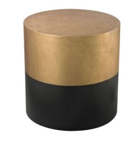
Love the Look? Find it Here.
What is our style reference? A leprechaun’s belt of course! And where there is a leprechaun and a rainbow there is a pot of gold. The great thing about this reference is we have now introduced another color into a palette. Look for other small detail moments to incorporate gold into your space to add additional refinement to the room. Use it in small quantities so as to not overpower the space.
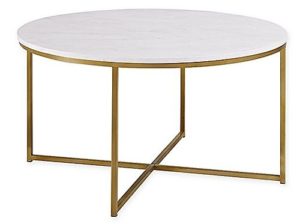
Love the Look? Find it Here.
We love the legs on this table. Sleek and low profile for refined elegance. The gold is classy yet understated and the perfect compliment to our decor.
Love the Look? Find it Here.
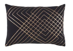
Design is in the details! This pillow combines the colors of the end tables with the patterns of the area rug.
Style Tip: Repetition Reinforces Design! If you have a great detail or pattern, repeat it!
4. Celebrate the Art
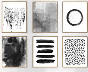
To keep the room modern and sophisticated opt for large scale framed modern abstract art. To keep the color consistent and to create a standout against the wall, opt for gold or black frames. Install at eye level centered over the couch. To keep costs down we like to utilize small vendors with handmade works. Etsy has some great artwork that is often sold in sets. Style Tip: Don’t feel compelled to keep art sets together. Break up the pieces across the room or in other adjacent spaces to make the space feel cohesive.
Love the Look? Find it Here.
Compliment the artwork with crisp, clean lined window treatments. Window treatments act as secondary wall accessories and can affect how your art work is viewed. Keep the same color palette for consistency. Opt for sheer window curtains to maximize the natural light coming into the space.

Love the Look? Find it Here.
5. Go Bold with Color
Contrasting colors create a bold, eclectic spaces. This is perfect as we seek to stay away from green but need a overall tie in. Blue is timeless, soothing, ever popular and compliments green nicely. Color is a great way to tell your design story.

Opt for deep saturated hues with bright undertones. Remember it is the spirit of a celebration that you are capturing. Keep the colors cheerful and uplifting.
Now let the festivities begin! Your newly designed space is the perfect place to host your very own St. Patrick’s Day party! Even better, you are left with a freshly designed, unique space for years to come. Your friends will be green with envy!
Until Next Time!
-D
