Designer tips for Modern Retro Style
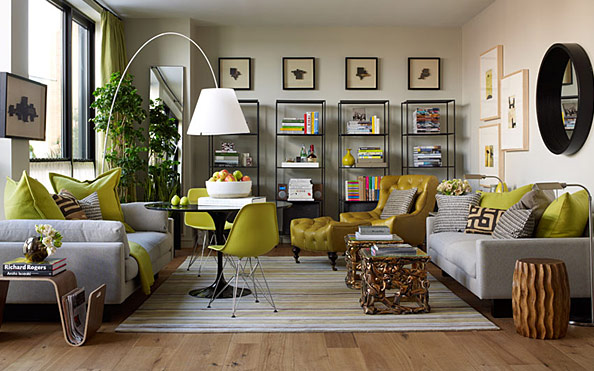
Photo: Elle Décor Modern Life Concept House
Ever wonder how to infuse design décor from 60s and 70s into modern living? Designers have been infusing historical references into their design concept for years. Many times its a subtle reference in the color story of the design palette, sometimes its a piece of heirloom furniture that ties a personal touch of family history. The designs of past decades were hard working multi-tasking pieces. Form follows function and a piece that didn’t serve a purpose was omitted. When designing a retro modern house, consider the usage of each piece and eliminate anything that doesn’t have a purpose. Not only will this help define your space, it will also help keep you from over designing. Keep your color story focused and consistent.
What I love about the Elle Décor Modern Life Concept house is the concentrated use of color. One bold accent color was selected and repeated in different ways throughout the space. The color choice is notably a popular color choice from decades past which instantly sets the context for the space. When paired with a neutral background, the accent immediately draws focus and attention.
I’m also drawn to the geometry of the space. Pairing rigid lines and curves on opposite sides of the room creates balance. Its all a balancing act when mixing different shapes and angles. For every gentle curve there needs to be a rigid curve. This grounds the space providing stability while also steadying the eye.
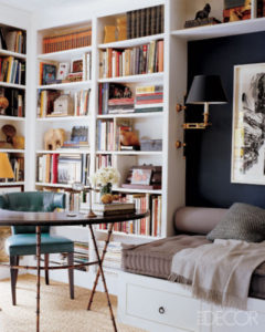
Photo: Elle Décor
Deciding what to put in a bookcase can be a daunting task. And easy tip: think of your books and decorative objects as mini works of art. The binding of a book can be beautiful. Once you start to stack a lot of books together before you know it you have formed a miniature color palette. This is a key opportunity not to be missed, especially if you are tryin to define an overall color direction for your space. Consider the height of the objects you are stacking and group similar objects together. For added interest, try stacking objects both vertically and horizontally.
If your bookcase is a neutral color paint the adjacent wall with a bold accent color. This instantly adds drama to a space and is especially powerful in small spaces. Use caution when selecting deeper tones and this will absorb much of the light in the space.
If there is not enough room for a table light or you don’t have a nearby outlet, consider adding an LED tape light to the side or top of your bookcase. This will give you maximum light with out taking up space and you can run the cord inconspicuously behind the cabinet!
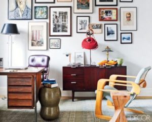
Photo: Elle Decor
The Modern Retro Inspired Office space is a minimalistic delight. Minimalism is hard, especially in today’s hurried lifestyle. We are constantly moving from one thing to the next and its easy to forget to clean up. I love that the busyness and attention is focused on the gorgeous gallery wall while keeping the work surface clean and organized. This is a great trick for those new to minimalistic design.
Another element that makes this room work is sticking to a specific time period and theme. The desk, credenza chair and stool are all mid century inspired pieces. The color of the rug and the pattern is also time period specific. The color prints respond to the color palette of the furniture which was a deliberate choice that helps define the space. Remember Focused and Consistent — the key to Modern Retro Inspired Spaces. Until next time. -D

One Comment
Pingback: