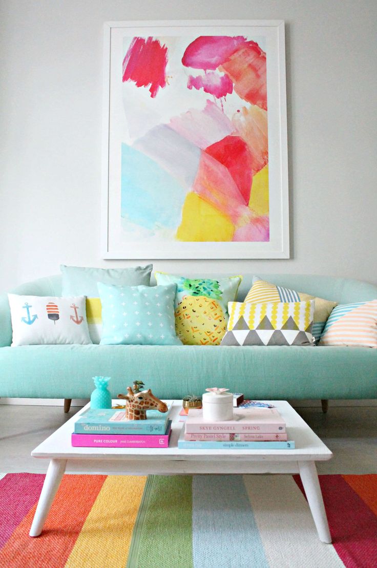
Using Color to Evoke Emotion
We admit it, we have been depressed. The current events during the last couple of weeks bring us to complete tears. Every life is precious and every moment is precious. Our hearts and prayers go out to everyone that has experienced loss, pain and are trying ever so desperately to rebuild their lives.
The interior environment can be so trivial at times. At the end of the day it’s just carpet, furniture, paint and accessories. Just simple everyday objects. But these objects can inspire us, they can unify us, they can calm us down or lift our spirits. Today we are going to focus on what inspires us, what brings us to our inner happy place.
For us it has always been about color. Bold, bright, and beautiful color. It’s instantly warms our hearts and makes us smile. One instant moment of pure happiness.
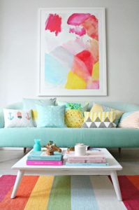
This living is a big dose of smiles. We love the colorful abstract painting. When going for big color it’s easy to over saturate. Doing so will make the room over bearing and unapproachable and cause eye fatigue. Look for colors that are all within the same color family. A good piece of artwork is a great place to start if your lost on how to design well with color. Simply pull the colors found in the artwork to outfit the rest of the space. The accent rug is a wonderful representation of this technique. All the colors are found in the painting and easily blend into this instant happy space.
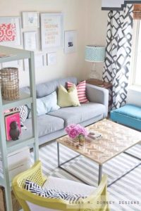
Somewhere the guardians of design are smiling. We love this room. It’s light and airy with fun pops of color. It’s completely effortless and we just want to collapse into that couch after a long day. We love the mix of textures which completely make the room. Think balance when adding texture to colorful spaces. Your eye will instantly go to what is different because it stand out the most. Human beings are sleuths this way, it’s rooted in our D.N.A. Use it to your advantage. Here the boldest pattern is on the curtain which draws all the focus to the incoming natural light. Notice that the use of pattern follows a diagonal trajectory from the curtains. Consistency and balance will help you create a rhythm in your design. In this case rhythm and balance are synonymous and the strength of the design. Infill remaining spaces with solid pops of color to complete the look.
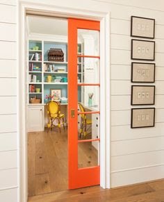
Sometimes you don’t have to fill a whole room with color. It can be a detail you want to highlight or a unexpected surprise you want to uncover. We love the pocket door with the fun, bright, mouth watering orange paint. It’s completely unexpected happy which is one of the best forms of happiness. We like to call it serendipity, an unexpected occurance. Typically we use pocket doors in small, tight spaces that we want to have the occaisional privacy. Most of the time the door remains closed. This provides a great duality. A fresh and clean neutral palette, against a bold bright, vivid color. For those new to using color this is a great technique. Keep it classy and simply and then wow them with an unexpected find surely to lift anyone’s spirit.
- Keep calm and Design On. Until next time! -D

3 Comments
BJ
Found this article on your website. It was a very nice read on the use of color! I too love the use if color; although I must admit I’m sometimes apprehensive in using it to its full advantage out of fear. Reading this article was very inspiring to me! Thanks.
dayreen
Thanks BJ. Don’t be afraid to reach out! We love to answer our readers questions and provide advice and tips to create your own dream space!
will whitner
Love your concepts, bold, but warm. Modern, but not over the top. What’s not to love.